How did we start
After a hot game provider like Gamax+ was introduced to the market until it became well known in the gaming industry, many adjustments and changes according to the changing times was inevitable. As for the website itself as well, Gamax+ consulted the WRK team on the development of the website to make it look more modern and attractive, while keeping the important content intact. Therefore, it was our duty to help provide advice and assistance to the fullest extent possible for the web page to come out attractive while at the same time maintain its modernity befitting of the hot game provider such as Gamax+
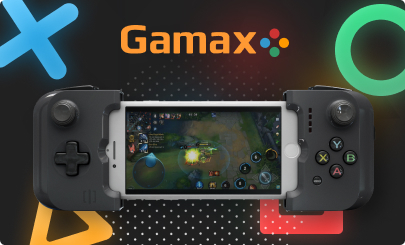
How did we start
As the project only involves the design of the website, therefore, it was the duty of the designer team to showcase their skills and create their achievement. Our team started looking for references and analyzing strengths and weaknesses which was to be used as components for the website
Concept Idea
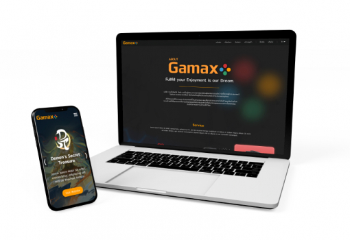
The requirement that we received was to make it attractive while at the same time maintain its modernity. The design team reached a consensus to use a black theme which will highlight the CI orange of Gamax+ while still maintaining the company's theme as well.
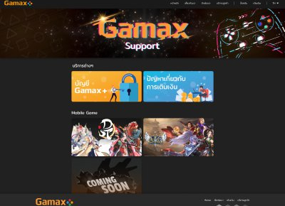
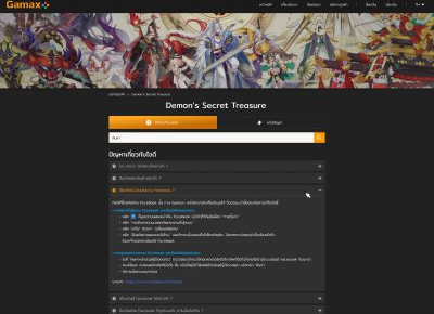
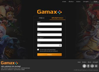


User Interface Design
The planned orange-black theme turned out to be the ideal combination. This made the end result acceptable without much difficulty. In terms of usability, the design team has settled on a rather simple finesse which was not flashy while allowing continuous visits to the website. The font design was easy to read and comfortable on the eyes.
Related Portfolio
Davin Cafe New Design
cafe & resturant website design v.2
Nowadays, cafes and resturants have many emerged. style and concept are varied according to the preferences of target groups. so it make competition and This is very interested for UX UI team to redesign website to most meet the needs customers.